No products in the cart.
Return To ShopHow to Choose Typography for Effective Design Projects
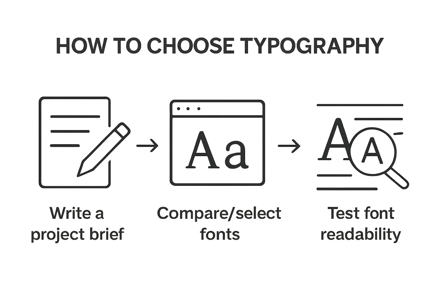
Typography can make or break how people connect with your design. Studies show even small changes in letter spacing or font style can dramatically shift both emotional response and reading speed. Most people think picking fonts is just about appearance or personal taste. The real driver is how well your typography lines up with your project’s goals and audience—and that’s what sets great design apart from forgettable visuals.
Table of Contents
- Step 1: Define Your Project Goals And Audience
- Step 2: Research And Select Font Styles
- Step 3: Test Typography With Initial Designs
- Step 4: Evaluate Readability And Visual Impact
- Step 5: Finalize And Implement Typography Choices
Quick Summary
| Key Point | Explanation |
|---|---|
| 1. Define project goals and audience | Establish clear objectives and understand demographics to guide typography choices effectively. |
| 2. Research diverse font styles | Explore various font categories and their characteristics to find those that align with your project’s message. |
| 3. Test typography in design mockups | Create multiple design iterations to evaluate font performance across contexts and potential readability challenges. |
| 4. Evaluate readability and visual impact | Assess how easily information can be read and emotionally connected to your audience for effective communication. |
| 5. Finalize and document typography choices | Develop a detailed style guide to ensure consistent implementation of typography across all project materials. |
Step 1: Define your project goals and audience
Successful typography design begins with crystal clear project objectives and a nuanced understanding of your target audience. Before selecting any typefaces or crafting visual compositions, graphic designers must develop a strategic foundation that guides every subsequent design decision.
Starting your typography journey requires a methodical approach to project scoping. Begin by asking fundamental questions about your design’s purpose: What message are you communicating? Who will be reading or experiencing this design? Understanding these core elements allows you to make informed typographic choices that resonate with your intended audience.
Consider the emotional and functional requirements of your project. A corporate annual report demands different typographic treatment compared to a children’s book illustration or a music festival poster.
Below is a comparison table outlining the main characteristics and typical use cases for different font types discussed in the article.
| Font Type | Characteristics | Typical Use Cases |
|---|---|---|
| Serif | Traditional, reliable, formal | Academic publications, financial reports, professional documents |
| Sans Serif | Modern, simple, clean | Digital interfaces, tech branding, contemporary design |
| Bold | Strong, dynamic, energetic | Youth-oriented campaigns, music festival posters |
| Clean | Clear, easy to read | Legal documents, body text in reports |
| Distinctive | Attention-grabbing, unique | Headlines, branding elements |
| Your typography must align with the project’s core communication objectives. For instance, a legal document requires clean, professional serif fonts that communicate authority and readability, while a youth-oriented digital campaign might utilize bold, dynamic sans serif typefaces that capture energy and movement. |
Audience analysis is equally critical in typography selection. Different demographic groups respond distinctly to typographic styles. Age, cultural background, professional context, and reading preferences significantly impact how typography is perceived. A tech startup targeting millennials will utilize different typeface strategies compared to a traditional financial institution serving an older professional demographic.
To effectively define your project goals, create a comprehensive design brief that explicitly outlines:
- Project purpose and primary communication objectives
- Target audience demographics and psychographics
- Emotional tone and visual brand positioning
- Specific functional requirements (print, digital, accessibility)
By meticulously mapping your project’s strategic landscape, you transform typography from a mere aesthetic choice into a powerful communication tool. Each typeface becomes a deliberate instrument designed to engage, inform, and connect with your specific audience.
Successful goal definition signals readiness to progress: Your design brief feels comprehensive, your audience understanding is nuanced, and you can articulate exactly how typography will support your project’s core message.
Step 2: Research and select font styles
With your project goals and audience clearly defined, the next critical phase involves comprehensive font style research and strategic selection. Typography is more than just choosing attractive letterforms. It is a nuanced process of finding typefaces that communicate your project’s core message with precision and emotional resonance.
Begin your research by exploring diverse font categories and understanding their inherent characteristics. Serif fonts communicate tradition, reliability, and formality, making them excellent for academic publications, financial reports, and professional documents. Conversely, sans serif fonts suggest modernity, simplicity, and clean communication, ideal for digital interfaces, technology branding, and contemporary design projects.
Professional designers leverage multiple research strategies to discover compelling font styles. Digital font libraries like Adobe Fonts, Google Fonts, and Typewolf offer extensive collections with comprehensive previews and detailed font information. These platforms allow designers to experiment with different typefaces, preview text samples, and understand how fonts perform across various contexts and sizes.
Here is a tools and resources table summarizing professional design tools and platforms mentioned for researching, selecting, and testing typography throughout your design process.
| Tool/Resource | Purpose | Platform Type |
|---|---|---|
| Adobe Fonts | Font library, typeface previews | Digital Font Library |
| Google Fonts | Extensive font selection, web compatibility | Digital Font Library |
| Typewolf | Font discovery, inspiration | Digital Font Library |
| Adobe XD | Prototyping, typography testing | Design Software |
| Figma | Design iterations, style system setup | Design Software |
| Sketch | Mockups, reusable type styles | Design Software |
| Readability Calculators | Quantitative typography evaluation | Digital Tool |
When selecting font styles, consider critical design factors beyond aesthetic appeal. Evaluate font legibility, readability, and performance across different mediums. A font that looks stunning on a large poster might become illegible when scaled down for mobile screens. Test your potential font choices in multiple sizes, weights, and environments to ensure consistent visual performance.
To streamline your font selection process, develop a systematic evaluation approach:
- Assess font compatibility with your project’s emotional tone
- Test readability across multiple devices and screen sizes
- Verify font licensing and usage restrictions
- Examine font weight and style variations
- Check cross platform and browser compatibility
Designers should also explore font pairing techniques. Combining complementary typefaces creates visual hierarchy and enhances overall design communication. A typical approach involves selecting a distinctive headline font and a clean, readable body text font that creates harmonious visual contrast.
Successful font style research culminates in a curated selection of typefaces that not only look appealing but effectively communicate your project’s core message. When you can articulate why each selected font supports your design objectives, you have completed this crucial research phase.

Step 3: Test typography with initial designs
After researching and selecting potential font styles, designers must transition into a critical evaluation phase: testing typography within initial design iterations. This stage transforms theoretical font selections into practical visual compositions, revealing how typefaces perform under real world design conditions.
Typography testing requires a systematic and comprehensive approach. Begin by creating multiple design mockups that showcase your selected fonts in various contexts and applications. These initial designs should represent different scenarios your project might encounter, such as digital interfaces, print materials, or responsive layouts. Professional designers recommend developing at least three to five design variations that explore font interactions, readability, and visual hierarchy.
Utilize digital design tools like Adobe XD, Figma, or Sketch to rapidly prototype and experiment with typography. These platforms allow designers to quickly generate multiple design iterations, test font combinations, and assess visual performance across different screen sizes and resolutions. Pay close attention to how fonts render at various sizes, examining legibility and aesthetic consistency.
When testing typography, focus on critical evaluation criteria. Examine how your selected fonts perform in different weights, sizes, and color combinations. Test body text, headlines, and supporting typography to ensure consistent visual communication. Look for potential readability challenges, such as letter spacing issues, line height problems, or visual fatigue that might emerge during extended reading.
To streamline your typography testing process, develop a comprehensive evaluation framework:
- Create design mockups representing multiple project scenarios
- Test font legibility across different sizes and mediums
- Evaluate visual harmony and contrast between font styles
- Assess performance in various color environments
- Verify accessibility and readability standards
Learn more about professional design tools that can support your typography testing workflow. Professional designers often collaborate with colleagues or conduct user testing to gather external perspectives on their typographic choices. Soliciting feedback from peers or potential end users provides valuable insights that might reveal subtle design improvements not immediately apparent to the original designer.

Successful typography testing culminates in a refined, validated type system that communicates effectively and looks visually compelling. When your initial designs feel cohesive, readable, and aligned with your original project objectives, you have successfully completed this crucial evaluation phase.
Step 4: Evaluate readability and visual impact
Readability and visual impact represent the critical intersection where typography transforms from aesthetic selection to functional communication. This evaluation stage determines whether your chosen typefaces effectively convey your project’s message while maintaining optimal reader engagement and comprehension.
Readability is not just about how easily text can be read, but how effortlessly information is understood. Professional designers employ both quantitative and qualitative methods to assess typographic performance. Begin by examining fundamental readability metrics such as character spacing, line height, and letter width. These technical elements significantly influence how smoothly readers can process information.
According to research on typographic legibility, typography should balance aesthetic creativity with functional clarity. Test your selected fonts across multiple contexts by creating sample paragraphs that represent different content scenarios. Examine how text performs in various sizes, weights, and background environments. Pay particular attention to body text readability, which requires sustained reader interaction.
Visual impact goes beyond mere legibility. Your typography must create an immediate emotional and intellectual connection with the audience. Designers should critically analyze how font styles communicate subtle psychological messages. A corporate report demands different visual energy compared to a music festival poster. Your typographic choices should reflect and enhance the project’s core narrative.
To systematically evaluate typography, develop a comprehensive assessment framework:
- Create reading comprehension tests with sample text
- Measure reading speed and information retention
- Assess visual fatigue during extended reading
- Evaluate emotional response to typographic design
- Check accessibility across different user groups
Utilize both digital and analog testing methods. Digital tools like readability calculators provide objective metrics, while analog approaches like user testing offer nuanced human insights. Invite colleagues or potential end users to review your designs, gathering feedback on their reading experience.
Successful readability evaluation requires honesty and willingness to iterate. When your typography consistently communicates information clearly, creates visual interest, and feels effortless to read across different contexts, you have achieved a robust typographic solution. The ultimate test is whether your design communicates its intended message effectively and engagingly.
Step 5: Finalize and implement typography choices
The final stage of typography selection transforms your carefully researched and tested design choices into a comprehensive, actionable style system. This critical phase requires precision, documentation, and strategic implementation across all project touchpoints.
Implementing typography is more than selecting fonts it involves creating a holistic visual language. Develop a comprehensive typography style guide that details exact font specifications, including precise sizing, weight, spacing, and usage rules for different content types. Professional designers create detailed documentation that serves as a blueprint for consistent visual communication across various design platforms.
Digital design tools like Figma, Sketch, and Adobe XD offer powerful features for establishing design systems. These platforms allow designers to create reusable type styles, ensuring consistent typography implementation across multiple artboards and design iterations. Establish a hierarchical type system that defines styles for headings, subheadings, body text, captions, and other critical text elements.
Licensing represents a crucial consideration during finalization. Verify that your selected fonts are properly licensed for your specific project requirements. Some font licenses restrict usage across different mediums or require additional payments for commercial applications. Carefully review font licensing terms to avoid potential legal complications and unexpected expenses.
To ensure comprehensive typography implementation, develop a systematic approach:
- Create a detailed typography style guide
- Establish consistent type hierarchy
- Define usage rules for different design contexts
- Verify font licensing and usage rights
- Document color, spacing, and alignment specifications
Collaboration becomes paramount during the implementation phase. Share your typography style guide with team members, clients, and stakeholders. Conduct comprehensive design reviews to ensure everyone understands and can consistently apply the typographic system. Consider creating visual examples that demonstrate correct and incorrect font usage to prevent potential misinterpretations.
Explore professional design system resources to refine your implementation strategy. Remember that typography is a living design element. Remain open to future refinements and adaptations as your project evolves. Successful implementation means creating a flexible yet consistent typographic framework that communicates your design vision effectively across all platforms and mediums.
The checklist below helps ensure you have completed all key steps for effective typography implementation and review, based on article recommendations.
| Step | Completion Criteria |
|---|---|
| Define project goals | Clear objectives, detailed audience analysis |
| Research and select font styles | Fonts reflect message, tested for readability |
| Test with initial designs | Mockups created, fonts evaluated in multiple contexts |
| Evaluate readability and impact | Readability confirmed, emotional response assessed |
| Finalize and document choices | Style guide created, licensing verified |
| Share and review with stakeholders | Design reviews completed, team understands usage |
Transform Your Typography Into Powerful Design With Kolorguide
Struggling to make your typography stand out while maintaining perfect color harmony? The journey from defining your project goals to finalizing your type system relies not only on choosing the right fonts but also on ensuring flawless color accuracy across every print or digital touchpoint. Your biggest challenges—aligning your brand’s emotional tone, guaranteeing readability, and achieving consistent visual impact—all demand reliable color management tools. Without trusted color references, even the most carefully selected typography can lose its edge and fail to communicate your true message.

Take your next step toward design confidence. Explore Kolorguide.com for industry-leading color guides, swatches, and professional supplies trusted by creative teams nationwide. Discover how our detailed product pages and rapid USA shipping help you deliver typography that looks as clear in print as it does on screen. Make your typography choices truly effective—visit Kolorguide.com and equip your projects with the color accuracy designers depend on.
Frequently Asked Questions
What are the key steps in choosing typography for design projects?
To choose typography effectively, first define your project goals and audience. Then, research and select appropriate font styles, test typography with initial designs, evaluate readability and visual impact, and finally, finalize and implement your typography choices.
How can I ensure that my typography matches the emotional tone of my project?
Consider the emotional and functional requirements of your project. Select typefaces that align with the message you want to communicate. For instance, serif fonts evoke tradition while sans serif fonts suggest modernity. Assess your target audience’s preferences as these can influence emotional connections to typographic styles.
What is the importance of readability in typography selection?
Readability is crucial because it affects how easily the audience can understand the message. Key factors include character spacing, line height, and letter width. Ensuring your typography is legible across various sizes and contexts enhances user engagement and conveys information effectively.
How do I create a typography style guide?
A typography style guide should document font specifications, including sizes, weights, and spacing rules. It should define a clear hierarchy for headings, body text, and captions, ensuring consistency across different design applications. Collaborate with your team to finalize this guide, enhancing communication and implementation of your design vision.
Ensure Print Surface Compatibility for Typography Applications
When typography moves from screen to print, material performance becomes critical. Even the most carefully selected typefaces can fail visually if ink adhesion is inconsistent.
For packaging, labels, coated papers, plastics, or specialty substrates, designers and print professionals often verify surface energy before production using Dyne Test Pens. These tools measure surface tension to ensure that inks, coatings, and varnishes will properly anchor to the material.
If surface energy is too low, typography may appear sharp digitally but suffer from poor adhesion, smudging, or fading in print applications. Incorporating surface testing into your implementation workflow ensures that your typographic precision translates flawlessly onto the final substrate.
Recommended
About author
Related posts
How long does corona treatment last? Corona treatment can last from weeks to several months under ideal storage conditions. However, factors such as contamination by... Continue reading
The Technical Foundation Behind Reliable Packaging and Graphic Arts Production In today’s global printing and packaging industry, quality is not subjective—it is measurable, verifiable, and... Continue reading
Discover why registration is important for businesses in the printing, packaging, plastics, and technology industries. Learn how it protects and boosts your company’s growth. Continue reading
¿Cómo los fluidos de energía superficial ayudan a evaluar la limpieza y adhesión en materiales industriales? (Vidrio, aluminio, plásticos y más) En muchas industrias... Continue reading
Explore essential printing press terminology to enhance your knowledge as a graphic designer or industry professional. Comprehensive insights included. Continue reading